Die
Grotesk
I had completely missed that Klim Type Foundry launched a new font at the start of this year, Die Grotesk.
![]()
I am no type designer, nor am I a graphic designer… or any other kind of designer. But I really appreciate a good neo-grotesque typeface (as you can probably tell from my use of Söhne on this blog).
As you may or may not know, I run the Ishtar Collective, a website dedicated to archiving and organising lore from the game, Destiny.
Many years ago, the supremely talented Bethany Heck redesigned the Ishtar Collective site, drawing inspiration from the International Typographic Style, and adopting Neue Haas Grotesk as the standard typeface.
Since then I’ve had a better appreciation for the subtle differences that set the various descendants of Neue Haas Grotesk apart.
Kris Sowersby, the director of Klim Type Foundry, is a pretty good writer too, and I really enjoyed reading the blog post that accompanies the release of Die Grotesk. After reading about his philosophy, his history, and his craft, it almost seems crude of me to talk about the details of the typeface – especially given I am not a designer myself.
But I’m going to talk about the details anyway.
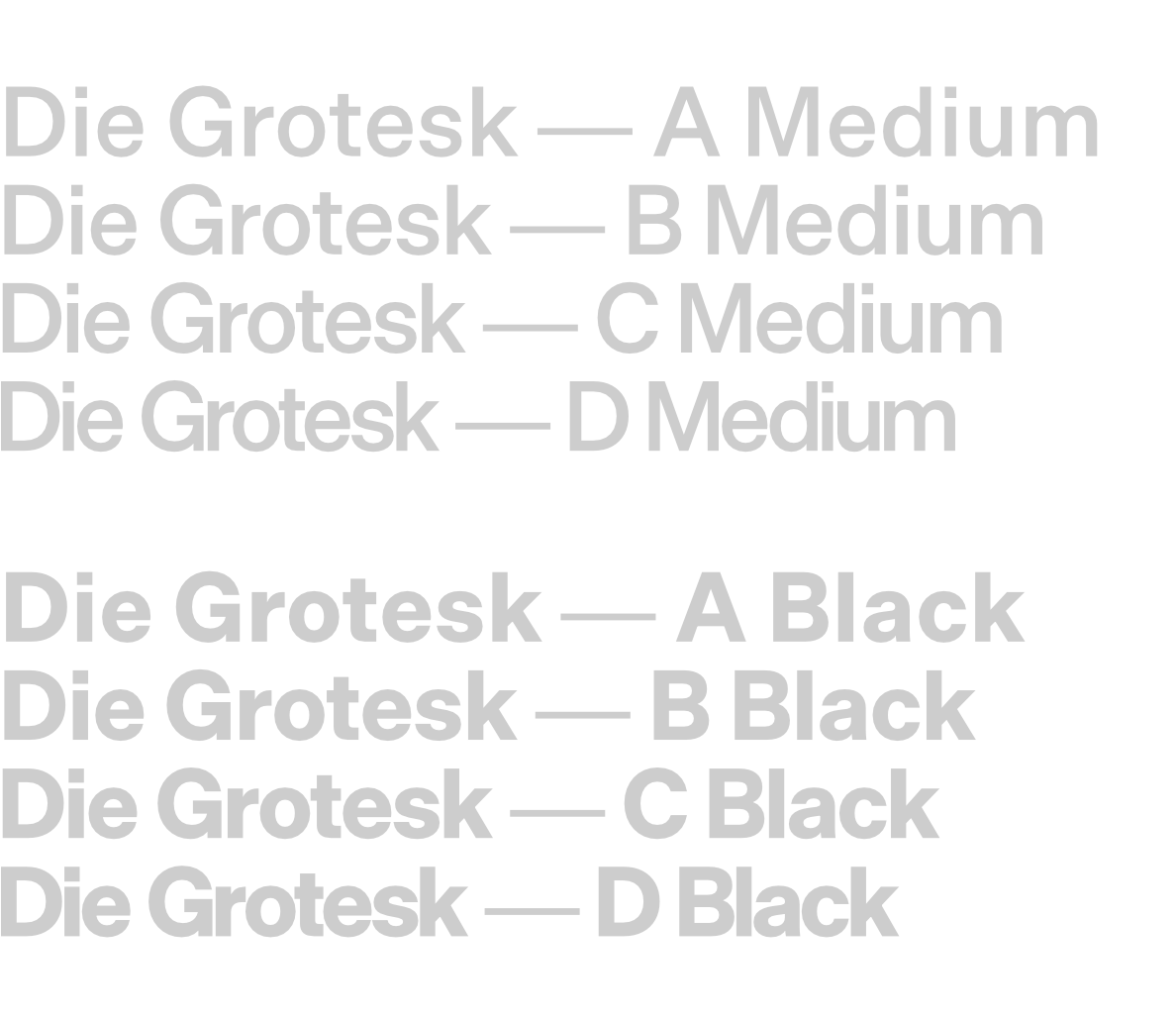
Die Grotesk is Klim Type Foundry’s first commercial variable font. It ships with four variants for every weight, A, B, C, and D. Each of the variants have carefully crafted tracking and kerning for different purposes, with the A variant having “sympathetic spacing for small text sizes”, while the D variant is much tighter and well suited for headlines and posters:
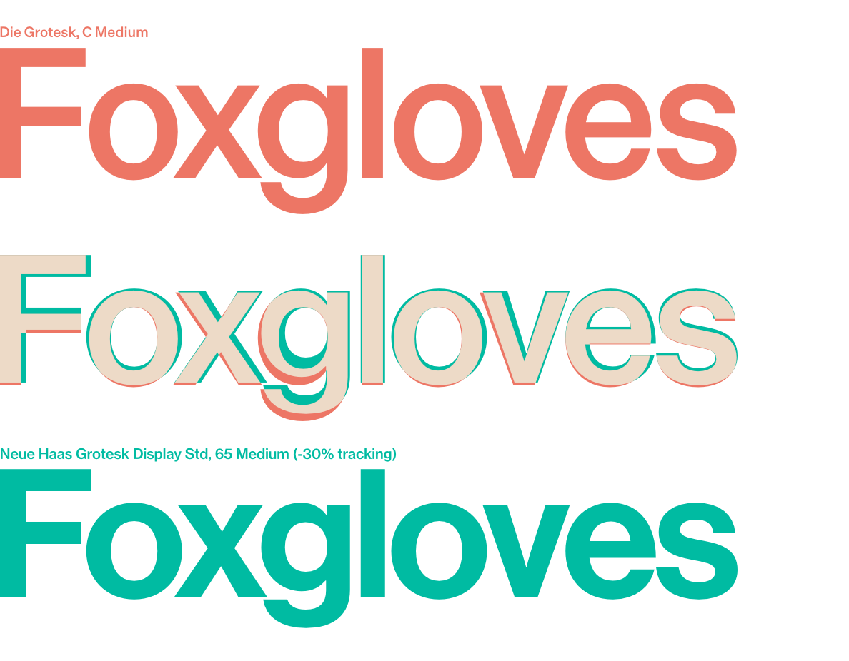
I was curious how the forms of Die Grotesk compared to Neue Haas Grotesk and thought I’d put together a very quick comparison.
Here’s how they look superimposed at a medium weight:
And here’s how they look superimposed at a heavy weight:
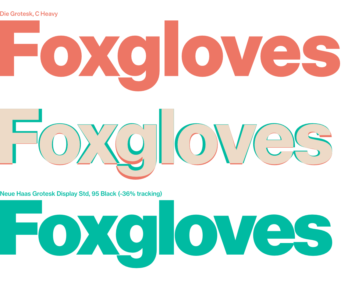
In both instances I had to adjust the tracking of Neue Haas Grotesk to make the comparison worthwhile.
I really like Die Grotesk. It’s wonderful to see another, well made, descendant of Helvetica.
Potentially related posts: