The Hunt for the Death Valley Germans
In the morning of October 21, 1996, Death Valley National Park (DVNP) Ranger Dave Brenner was aboard a military helicopter somewhere in the skies over the southerly part of Death Valley. He was part of a routine aerial surveillance looking for clandestine drug manufacturing labs in the backcountry. Around 11 AM, he saw something unexpected: A vehicle in the wash of Anvil Canyon, approximately 2.4 miles downstream from Willow Spring, the head of Anvil Canyon. This was extremely odd for several reasons.
A well written, first hand account of the Hunt for the Death Valley Germans by Tom Mahood.
Cleaner Jujutsu logs
I mentioned a little bit in my previous Jujutsu post that I find the default Jujutsu logs too noisy.
I love syntax highlighting, but I’ve always felt that if everything is highlighted then nothing is highlighted, which is exactly the point that tonsky makes in his recent blog post on syntax highlighting.
Solstice Sunrise
During the winter solstice in the northern hemisphere, when the North Pole is tilted furthest away from the sun, at 08:15 UTC, a person in London and a person in Rio de Janeiro can watch the sunrise at the same time.

Screenshot from Interactive Day Night World Map with Real-Time Terminator
Can't sleep. AWS is down.
Smart Bed Owners Forced to Sleep Sitting Up During AWS Outage:
Eight Sleep’s $2,000+ ‘Pod’ mattress covers went offline during the outage, causing them to become stuck at high temperatures and inclined positions.
I feel like when your sleep relies on us-east-1 being up and running, you know you must have made some bad decisions in life.
Adopting
Jujutsu
How I've been switching from Git to Jujutsu
I’ve always loved the safety net that a VCS like Git provides, but I’ve never loved git’s user interface/experience, nor the mental model that I’ve tried to hold in my head while I’m using it.
Jujutsu has been on my radar for a while now, and over the past few months I’ve been using it instead of Git as much as possible.
It took me a while to understand some of the concepts (and I’m still learning), and I wish I had found some better examples of people moving from my workflow to Jujutsu sooner. So if your Git workflow is at all like mine, then hopefully this post will be useful to you.
Die
Grotesk
I had completely missed that Klim Type Foundry launched a new font at the start of this year, Die Grotesk.
![]()
I am no type designer, nor am I a graphic designer… or any other kind of designer. But I really appreciate a good neo-grotesque typeface (as you can probably tell from my use of Söhne on this blog).
As you may or may not know, I run the Ishtar Collective, a website dedicated to archiving and organising lore from the game, Destiny.
Many years ago, the supremely talented Bethany Heck redesigned the Ishtar Collective site, drawing inspiration from the International Typographic Style, and adopting Neue Haas Grotesk as the standard typeface.
Since then I’ve had a better appreciation for the subtle differences that set the various descendants of Neue Haas Grotesk apart.
Kris Sowersby, the director of Klim Type Foundry, is a pretty good writer too, and I really enjoyed reading the blog post that accompanies the release of Die Grotesk. After reading about his philosophy, his history, and his craft, it almost seems crude of me to talk about the details of the typeface – especially given I am not a designer myself.
But I’m going to talk about the details anyway.
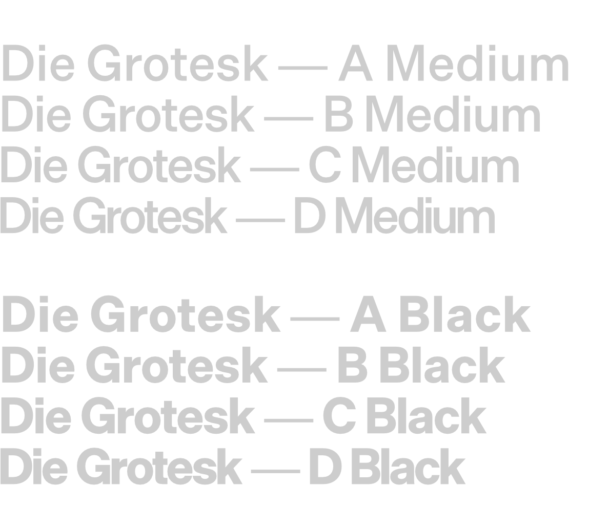
Die Grotesk is Klim Type Foundry’s first commercial variable font. It ships with four variants for every weight, A, B, C, and D. Each of the variants have carefully crafted tracking and kerning for different purposes, with the A variant having “sympathetic spacing for small text sizes”, while the D variant is much tighter and well suited for headlines and posters:
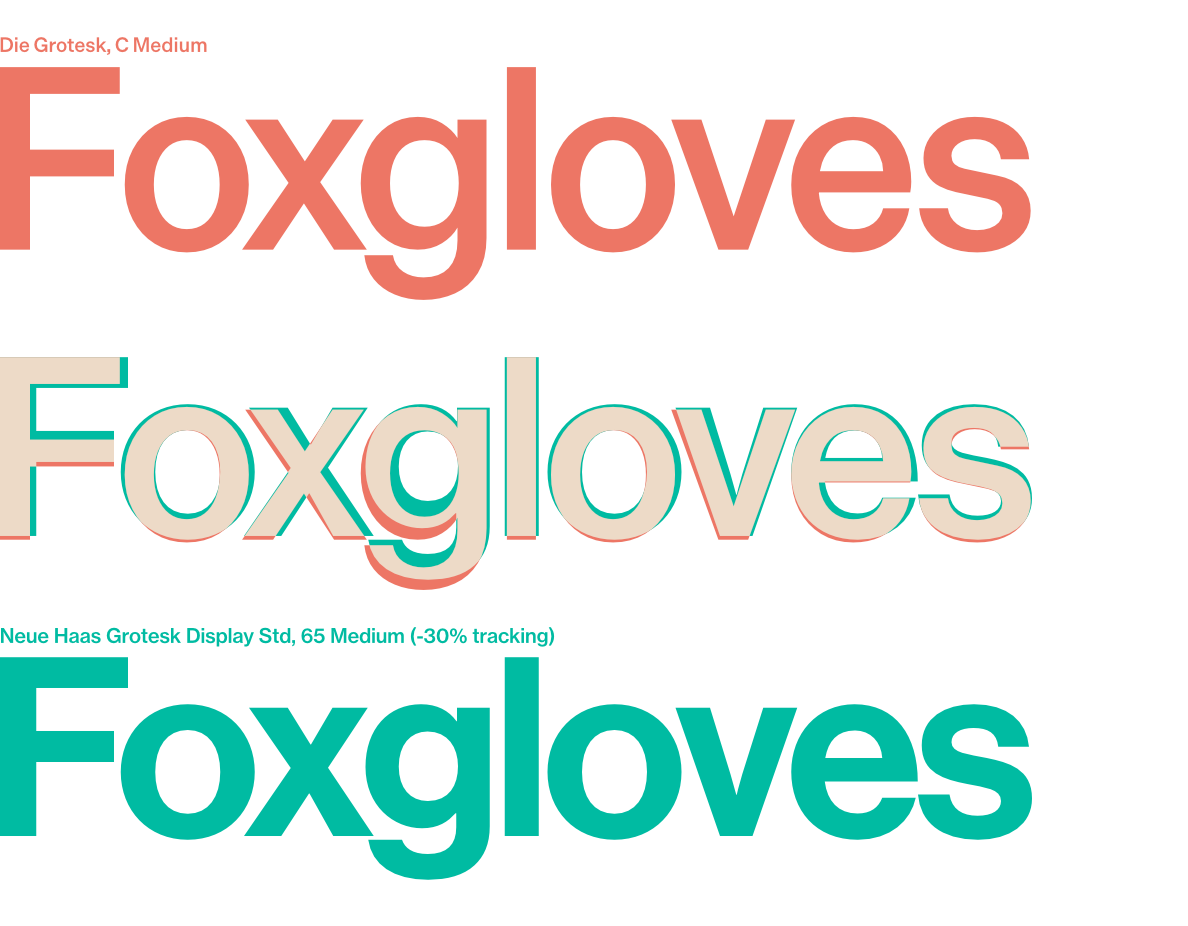
I was curious how the forms of Die Grotesk compared to Neue Haas Grotesk and thought I’d put together a very quick comparison.
Here’s how they look superimposed at a medium weight:
And here’s how they look superimposed at a heavy weight:
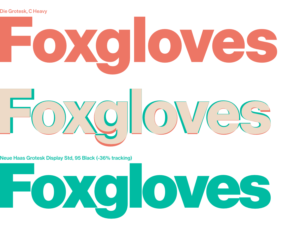
In both instances I had to adjust the tracking of Neue Haas Grotesk to make the comparison worthwhile.
I really like Die Grotesk. It’s wonderful to see another, well made, descendant of Helvetica.
Naming OKLCH colours
I really like using variable names for colours1 rather than just the plain CSS hex code. It feels nicer to talk about colours by their names.
Sometimes I like to pick colour names based on the context in which they’re being used, but other times I just want a nice name, and I like using Chirag Mehta’s “Name that Color” tool.
Up until recently the colours I used on this blog for highlights were:
:root {
  --flamingo:       #f14a38;
  --mojo:           #c44536;
  --burnt-sienna:   #E9724C;
  --pale-prim:      #FDFEB8;
  --mango:          #FFC857;
  --wasabi:         #9EA93F;
  --verdigris:      #38A3A5;
  --curious-blue:   #19a0de;
  --byzantine:      #5569ee;
  --lilac:          #A06CD5;
}
Which, when placed side by side, looked like this:
And I quite liked them, but recently I felt a bit dissatisfied with the way that the colours weren’t evenly spaced out, in terms of their hue, and weren’t consistent in terms of their intensity or brightness.
After reading about OKLCH I wondered if picking a single colour and rotating through the hue would give me a better set of colours.
I used oklch.com to try out a few different colours. It has a really nice feature that lets you see whether the combination of chroma and lightness are likely to result in a visible colour as you adjust the hue.
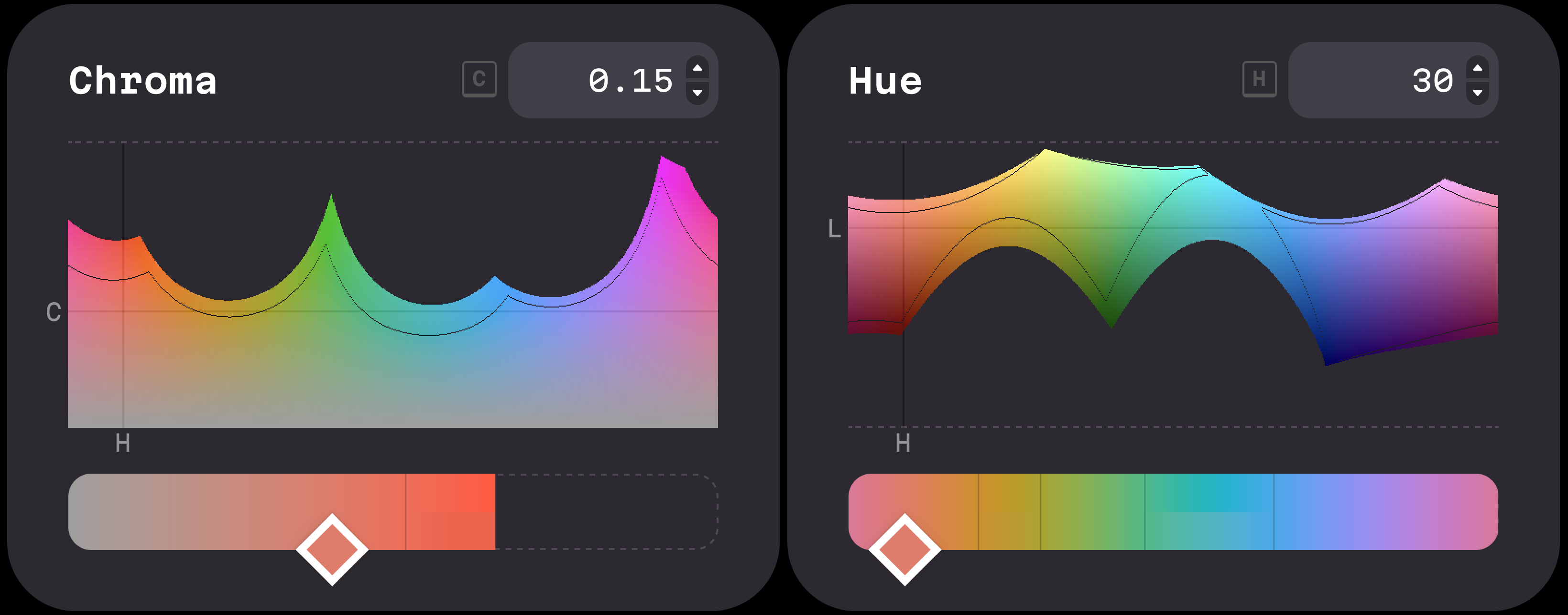
After trying a few different options I settled on oklch(0.7 0.15 30), which I felt looked reasonable:
I then created 9 other colours, each 10° apart:
If I was using hex codes then I’d use “Name that Color” to get a nice name for each of them, but obviously that isn’t going to work with OKLCH.
Thankfully there’s a JavaScript library called Culori that can convert RGB to OKLCH, and there’s also a JavaScript library called ntcjs which produces the same colour names as the “Name that Color” site.
So running:
import { oklch, formatHex } from 'culori';
import ntc from 'ntcjs';

const oklchColors = [
  { l: 0.7, c: 0.15, h: 30},
  { l: 0.7, c: 0.15, h: 60},
  { l: 0.7, c: 0.15, h: 90},
  { l: 0.7, c: 0.15, h: 120},
  { l: 0.7, c: 0.15, h: 150},
  { l: 0.7, c: 0.15, h: 180},
  { l: 0.7, c: 0.15, h: 210},
  { l: 0.7, c: 0.15, h: 240},
  { l: 0.7, c: 0.15, h: 270},
  { l: 0.7, c: 0.15, h: 300}
];

oklchColors.forEach(color => {
  const oklchColor = {
    mode: 'oklch' as const,
    l: color.l,
    c: color.c,
    h: color.h
  };

  const hexColor = formatHex(oklchColor);
  const [_closestHex, colorName, _isExact] = ntc.name(hexColor);
  const safeVarColorName = colorName.toLowerCase().replace(/\s+/g, '-');
  console.log(`  --${safeVarColorName}: oklch(${color.l} ${color.c} ${color.h});`)
});
Gives:
:root {
  --burnt-sienna:     oklch(0.7 0.15 30);
  --zest:             oklch(0.7 0.15 60);
  --buddha-gold:      oklch(0.7 0.15 90);
  --sushi:            oklch(0.7 0.15 120);
  --chateau-green:    oklch(0.7 0.15 150);
  --caribbean-green:  oklch(0.7 0.15 180);
  --cerulean:         oklch(0.7 0.15 210);
  --picton-blue:      oklch(0.7 0.15 240);
  --malibu:           oklch(0.7 0.15 270);
  --biloba-flower:    oklch(0.7 0.15 300);
}
And for the sake of completion, here are the colours side by side with their names:
Nice!
-
I spell “colour” with a “u” where I can, because I am in the UK, but I appreciate that CSS uses “color”. ↩
TIL º is not °
I often use the keyboard shortcut option + 0 on a Mac to print a degree symbol. Or so I thought. I tried using it in a blog post, and noticed that the character it produced doesn’t look like a degree symbol in this typeface, instead it looked like this: º
It turns out option + 0 actually produces the masculine ordinal indicator.
To produce a degree symbol on a Mac the keyboard shortcut is option + shift + 8.
Trump will fire generals he dislikes
Newsweek reports that in Pete Hegseth’s much hyped meeting with the USA’s top generals, Trump told them:
I’m going to be meeting with generals and with admirals and with leaders, and if I don’t like somebody, I’m gonna fire them right on the spot.
And
I told Pete, we should use some of these dangerous cities as training grounds for our military, National Guard, but military, because we’re going into Chicago very soon, that’s a big city with an incompetent governor.
David Cross on Riyadh Comedy Festival
I was pleased to read David Cross’s opinion on the comedians that agreed to take part in the upcoming Riyadh Comedy Festival.
I am disgusted, and deeply disappointed in this whole gross thing. That people I admire, with unarguable talent, would condone this totalitarian fiefdom for…what, a fourth house? A boat? More sneakers?
…
All of your bitching about “cancel culture” and “freedom of speech” and all that shit? Done. You don’t get to talk about it ever again. By now we’ve all seen the contract you had to sign.
…
I don’t understand how being rich can make someone such a whore. Poor people desperate to improve their (or their families lives), sure. Still not acceptable but I can understand the desperation to put food on the table. But this? I mean, it’s not like this is some commercial for a wireless service or a betting app. This is truly the definition of “blood money”.
Previously Atsuko Okatsuka shared the contract she would have had to sign had she agreed to take part in the comedy festival.
Content Restrictions: ARTIST shall not prepare or perform any material that may be considered to degrade, defame, or bring into public disrepute, contempt, scandal, embarrassment, or ridicule:
- A) The Kingdom of Saudi Arabia, including its leadership, public figures, culture, or people;
- B) The Saudi royal family, legal system, or government, and;
- C) Any religion, religious tradition, religious figure, or religious practice.
Imgur blocks the UK
From today, requests to image hosting site Imgur result in the following:
{"data":{"error":"Content not available in your region."},"success":false,"status":400}
This thread on Reddit contains a response from Imgur:
Imgur at this time will no longer be able to provide uploading and/or signing in functions within your designated region (United Kingdom).
While they don’t say it, this is no doubt a result of the Online Safety Act.
Given how heavily Imgur is used for hosting images on Reddit and other sites, this is going to have a noticeable impact on the way many people use the web. I wouldn’t be surprised if it drives more people to use VPNs or to otherwise circumvent location-based blocking.
Sargasso Sea
The Sargasso Sea is the only sea without any land boundary.
The Gulf Stream establishes the Sargasso Sea’s western boundary, while the Sea is further defined to the north by the North Atlantic Current, to the east by the Canary Current, and to the south by the North Atlantic Equatorial Current. Since this area is defined by boundary currents, its borders are dynamic, correlating roughly with the Azores High Pressure Center for any particular season.
Em dash
For as long as I have known that there were different types of dashes I have loved em dashes.
That they have become a hallmark of AI generated text is deeply upsetting to me.
I refuse to stop using them.
Media coverage of Reform & UKIP
Which reminds me of this study: Does Media Coverage Drive Public Support for UKIP or Does Public Support for UKIP Drive Media Coverage?
Some have argued that extensive media coverage of UKIP is justified due to public support for the party. The findings here, however, are mostly inconsistent with this argument: the extraordinary media coverage that has been given to UKIP cannot be explained or defended on grounds of public opinion dynamics as measured by polls. We find that media coverage has no reliable relationship to public opinion polls in the one month, two months or three months before a particular month of coverage. Indeed, we find that coverage may have independently and uniquely driven some of the very public support that media regulators would later point to as their justification for the extraordinary coverage given to UKIP.
A comment on team morale
I was recommended a post by Reddit’s algorithm, and this comment by /u/leros stood out to me:
We had some gender issues in a growing organization I used to work at. Women were complaining that they were getting too harsh feedback and not enough support. At first people were thinking of this as a “how to treat women better” problem, but what we actually realized is that the men were just used to being treated poorly. Things like harsh feedback, minimal support, etc. Addressing these issues not only resolved the issues the women were complaining about but improved morale among the men as well.
Maple
Mono
I was setting up my new Mac and decided to try something different to my usual monospace font of choice, MonoLisa.
I was aiming to find a typeface reminiscent of the early Apple keyboards, like the one used on the Apple Extended Keyboard II (which was apparently a form of Univers 57 Oblique), but instead I stumbled across the beautiful Maple Mono.
I’ve been using it in iTerm and VS Code consistently for a few weeks now and I really like it. I especially like using the italic variant for type hints in Rust, which you can enable by adding this to your settings.json in VS Code.
{
  "editor.inlayHints.fontFamily": "MapleMono-NF-ThinItalic"
}
This actually took me a while to figure out, so hopefully that is helpful to someone!
Bookmarking
I’ve been saving bookmarks for a long time.
I started saving bookmarks to del.icio.us a long time ago, and then when del.icio.us was sold to Yahoo, I started saving them to Pinboard.
My oldest bookmark is for A List Apart, saved in July 2005!
But recently I’ve been feeling the urge to write more, and I’ve also been feeling like I could do more with the bookmarks that I save. So I’m going to start trying to use this site for bookmarks. Maybe not instead of Pinboard, but as well as pinboard.
Omnifixo
I’ve been obsessed with these tiny clamps for a while now. I never really do any soldering or anything so I have no real use for them, but I just think they’re great.

What are OKLCH colors?
I enjoyed this short post on OKLCH colours by Jakub Krehel.
If you are on a display that supports Display-P3, you will see the right colors more vivid than the left ones. If you are on a display that only supports sRGB, the colors should look nearly identical, as the browser maps the out of gamut color back inside the sRGB gamut.
I also enjoyed playing with the tool Jakub built to explore OKLCH.
Initial
commit
git add .
My biggest problem (actually, not my biggest problem). Amongst my biggest problems is the problem that I would rather spend days messing around with the code that powers a blog than actually writing blog posts. I literally spent several minutes today wondering how I would show related posts. A problem that will definitely not rear its head until I have more than one blog post.
Programmers waste enormous amounts of time thinking about, or worrying about, the speed of noncritical parts of their programs, and these attempts at efficiency actually have a strong negative impact when debugging and maintenance are considered. We should forget about small efficiencies, say about 97% of the time: premature optimization is the root of all evil. Yet we should not pass up our opportunities in that critical 3%.
Some classic Donald Knuth Truth for you there.
So in the interest of postponed optimization, here is a blog post.
I don’t know if RSS works yet. I don’t know if anything works yet. The design is a work in progress, roughly inspired by the work of Josef Müller-Brockmann. It doesn’t work on mobile yet. Maybe soon.
Wish me luck.